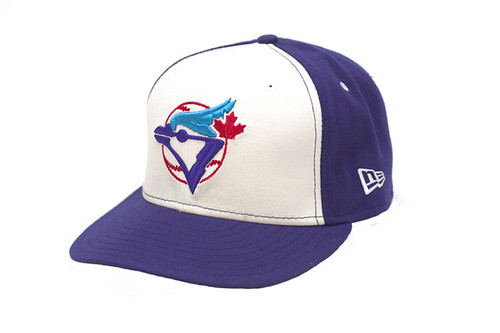
It was almost four years ago that I begged the Blue Jays to bring back their old logo. That old Jays logo is the only one I'll wear. I love how the double blues are complemented by a healthy dose of Canadian red (with actual maple leaf!) popping on white. Here it is, in case you forgot what it looked like.

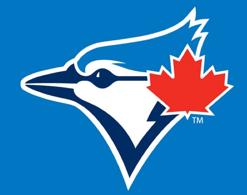
A site called Uni Watch claims to have the latest Jays logo, which looks like an updated version of their original. You'll see that supposed new logo below.

Muuuuuuuch better. The red maple leaf is back, and the blue jay looks great. I would wear this new logo.
What do you guys think? Do you like this new Blue Jays logo?


