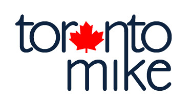
We're now live with our new Toronto Mike logo. That's right, I'm using words like "we" and "our" to make this look like it's more than one guy. The clever ones will see through the facade, and the others will just be impressed.
Here's a bigger view of the new Toronto Mike logo.

What do you think?


