I love that retro CBC logo with the orange, yellow and red colour scheme. You may have noticed I played off of it for the header image I threw on this site after FUVC went bust. After a few weeks of the Ceeb, I felt it was time for something a little more summery.

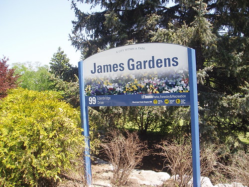
The new header was inspired by a picture I took this afternoon at James Gardens. As you will see, all I changed was the text.

And finally, I added a neat little widget to the Contact Mike page. If I'm online, you can chat with me in real-time. It's pretty slick, go ahead and give it a whirl.


